//
Jul 19, 2016
Embrace Being Spacey: Leading, Kerning, and Tracking
Graphics, photos, and smart marketing design, revolve around visuals.
Your business’s marketing material must be visually appealing to your consumers in order to grab their attention. In order to create visually appealing content, you need a balance of space between color, lines, and text. We often think of text simply as words displayed in different fonts, serif vs. sans serif, elegant cursive or crisp clean print, but in reality, the spacing of your text, and even individual letters, can make or break your advertisement.
The text of your ad relays your marketing message; therefore, it needs to be both visually appealing and readable. Spacing individual letters, words, or lines of text can help to achieve this, but before we dive into spacing, here are some basic text terms to know:
- X-height: a characteristic of fonts that measures the height of a lower-case ‘x’
- Baseline: the baseline of a line of text is the “invisible line” that the letters sit on
- Descenders: these are the parts of certain letters that fall below the baseline (e.g., g, q, p, and j)
- Ascenders: these are “stems” of certain letters with taller features (e.g., b, d, and h)
The spacing of letters and words can affect how these elements interact, overlap, and the overall readability of your text. Knowing that, balance of space is everything. There are three ways to adjust the spacing of your text:
LEADING
Remember back in school when you were required to turn in a research paper that was double- or single-spaced? Try not to remember the procrastination and all-nighters cranking out five to ten pages. Instead think of the line spacing. Leading (pronounced leh-ding) is the professional term for line spacing and refers to the space between two vertical lines of text.
It’s important to remember that increasing the space between lines of text can increase or reduce the amount of space between ascenders and descenders. This can affect readability, but as our research papers taught us, the larger the spacing, the less you had to write to fill the page up. According to , a general rule of thumb is that leading should be 20 percent greater than the font size; however individual fonts will vary.

(Photo Courtesy of Creative Market)
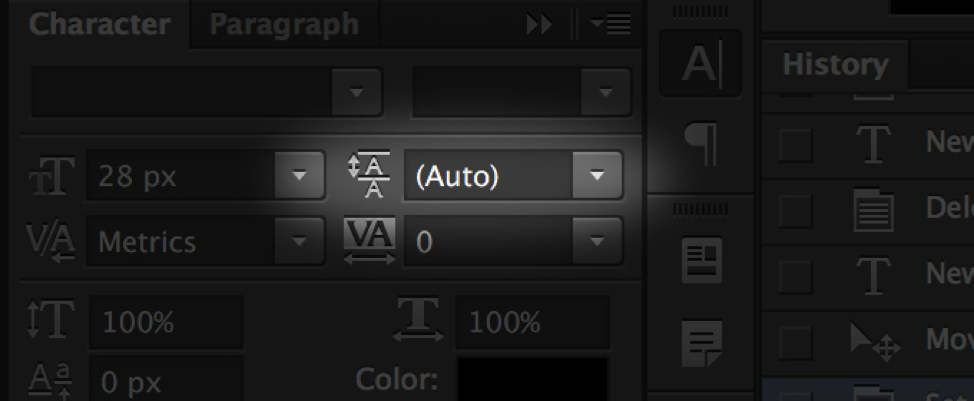
Adjusting text leading is fairly simple and can be done in both Adobe Photoshop and Microsoft Word. In Photoshop, this can be done with the leading button. (PHOTO CREDIT OF CREATIVE MARKET) In Microsoft word, simply select the passage of text, right click, and select “Paragraph…” You can then adjust the line spacing by selecting one of the drop-down box options or by entering a number in spacing box.
KERNING
Kerning refers to the space between individual letters or words and has the greatest effect on readability. While no two spaces have to be the same size, smart marketing design is essential. When adjusting kerning, proportional spacing is key. You should also take into account the font you’re using as well as any serifs and stylistic attributes. Kerning is all about visual space; therefore, the best judge is the human eye.
Creative Market suggests breaking up words into groups of three letters and by flipping the text upside down so that the baseline is at the top. By doing this, you can see the effects of kerning changes more easily. Like leading, kerning can also be adjusted in both Photoshop and Microsoft Word.

(Photo Courtesy of Creative Market)
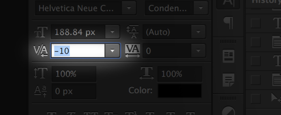
In Photoshop, place the cursor between the two characters you want to adjust the kerning between. You can then use the kerning button, located underneath the text size box. If you’re more savvy with keyboard shortcuts, hold the ‘alt’ or ‘option’ key, depending on your device, and then use the directional arrows to increase or decrease the space between the characters. On Word, highlight the characters you wish to adjust, and then navigate to Format > Font. In the pop-up dialogue, check the “kerning for fonts” box. You can then adjust the kerning with the up and down arrows next to the box or by entering a number.
TRACKING
Tracking is similar to kerning, so much so that the two are often confused. Unlike kerning, tracking does not change the spacing between individual letters and words. Rather, allows you to adjust spacing between letters equally at once. You could achieve the same result using kerning, but it would be a much longer process.
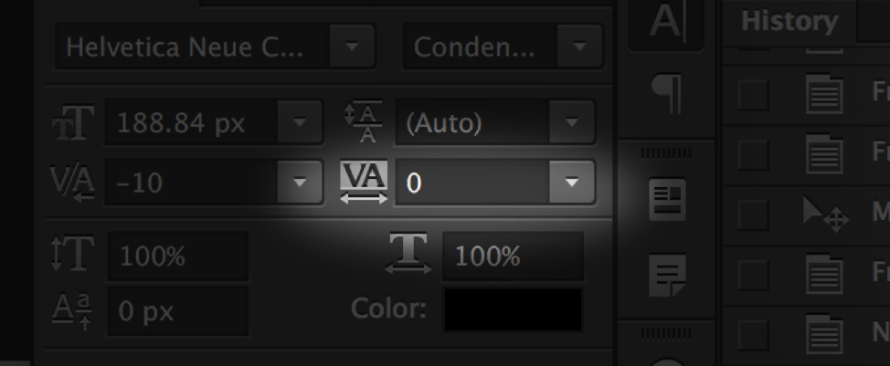
Tracking is generally used to fill in spaces that are either too small or too large for the word. Like leading and kerning, it also can be adjusted on Photoshop and Word. On Photoshop, you can adjust the tracking by entering a number into the field below the kerning area. With keyboard shortcuts, hold ‘alt’ or ‘option’ and use the directional arrows to adjust the spacing. In Word, highlight the passage of text and like kerning, navigate to Format > Font. In the dialogue box, under “character spacing,” adjust the “spacing” with one of the drop-down box options or by entering a number in the field.

(Photo Courtesy of Creative Market)
Leading, kerning, and tracking are just a few of the ways to adjust your text to create a more visually appealing marketing material. The main thing to remember when adjusting space is to use smart marketing design, meaning you should ensure your text is visually appealing and readable. The proper balance of spacing will result in a passage of text that is both visually appealing and readable. Combining this with color, lines, and other design elements will grab your consumers’ attention and greatly enhance the marketing content you create for them.


